Epic Sciences
Epic Sciences innovates in the complex and competitive arena of rare disease diagnostics. Over the last decade, they have pioneered an effective approach, rooted in rigorous blood cell analysis. While they have the data to back it up, they lacked the Wall Street recognition they deserved. Epic’s leadership sought greater visibility and credibility for their approach and asked One Degree to help elevate the company image. (Previously the San Diego company’s identity was a somewhat random “wave” icon.)
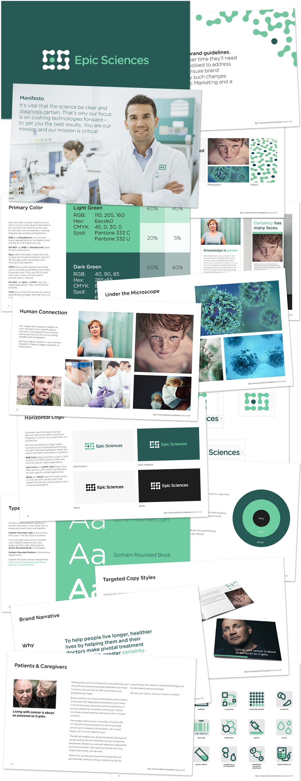
The brief: Epic Sciences helps people live longer, healthier lives by giving them and their doctors the ability to make pivotal medical treatment decisions with certainty. Thus, the brand should communicate both scientific precision and human warmth. We developed a new logo and identity system that clearly refers to cells — the source of Epic’s differentiation. We paired the scientific ID and cool green palette with gritty, wholly-honest photography of people’s faces. The combination expresses Epic’s commitment to scientific innovation in service to human health and happiness. At a deeper level, the logo comprises a random collection of cells in which, upon closer inspection, a pattern emerges. In the same way, Epic’s approach is to reveal both aberrant cells and cell patterns to assist in predicting treatment outcomes.
Following logo design and comprehensive brand standards development, the full brand identity was applied to all business materials, website, conference materials, and internal sales and marketing templates.