Mediterraneo
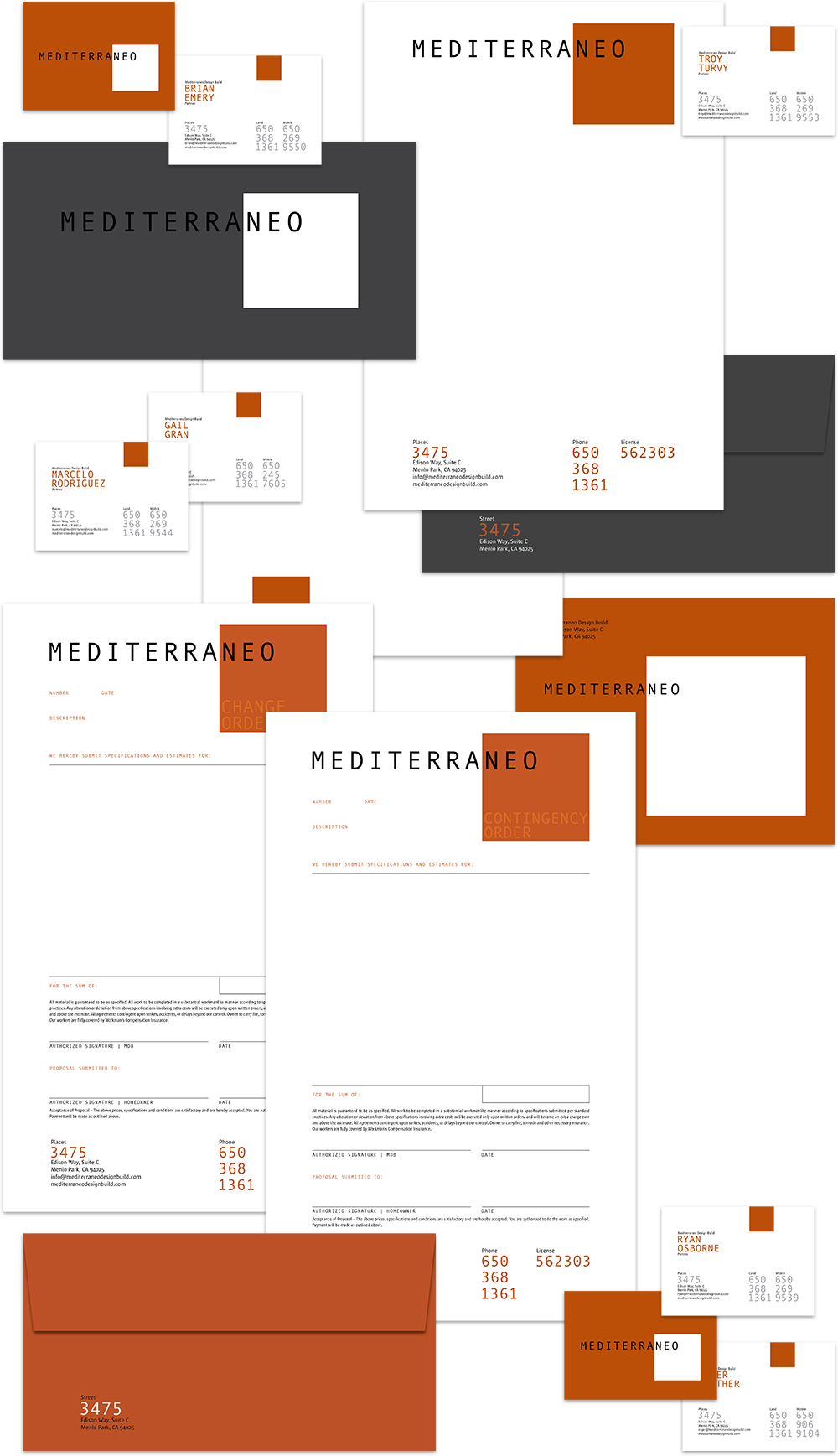
Mediterraneo’s partners felt their name pigeon-holed them as builders specializing in Mediterranean-style home design and construction, thus wanted to abandon it. But twenty years of equity is a lot to sacrifice, so we redesigned the logo instead. We married “Mediterraneo” with a square field to emphasize the last three letters, “neo,” and lend a subtle message, “new structure.” We developed a color palette dominated by terra cotta and cement — two prominent colors in California construction, and shot gritty photography depicting their crews hard at work, and architectural-style imagery of their projects.